Posted: September 21,2017
Meet the New TH Foods
Research-based innovation, proprietary cooking processes and open collaboration. These values have been central to TH Foods since the beginning. That’s why today we’re excited to announce our new brand identity that will better reflect who we are as a company.
“For more than 30 years, we’ve worked closely with our customers, conducted extensive market research and invested in the latest technology for our kitchens so that we can we can provide tasty snacks that disappear off the shelves,” said Kim Holman, marketing director. “We’ve positioned ourselves as an industry innovator, but the look of our brand didn’t reflect that. It was time for a change.”
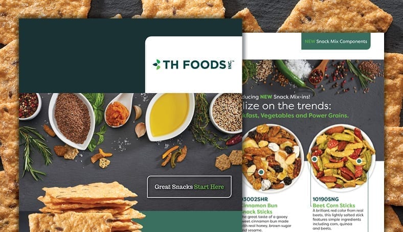
So, change we did. Our rebranding efforts include the introduction of a new logo, website and print materials. During our brand overhaul, we freshened up the colors, fonts and overall design to capture the essence of TH Foods.
Green continues to be the central color in our brand. Our new, brighter shades of green represent fresh ideas and fresh ingredients.
The logo adopted a clean, sans-serif font with a simplistic design. This modern look is a nod to our dedication to innovation, and the three shapes represent the core areas of our business: Private Label/Co-manufacturing, Snack Mix Components and Retail. The clean and simple elements of the design reflect our natural ingredients and clean labels.
“The TH Foods brand has undergone a significant transformation,” said Holman. “The fresh look signifies our commitment to our core values – to staying on top of industry trends – to innovating our snacks to give our customers what they want.”
We are still the same company – the same team – that works hard to deliver delicious, better-for- you snacks. Our name, processes and values haven’t changed. Just our look. Our team is excited about the fresh new look and feel. We hope you like it, too.